
Get started
Florian Berding and Julia Pargmann
2026-04-01
Source:vignettes/iotarelr.Rmd
iotarelr.Rmd1 Introduction
iotarelr is a package for estimating the components of the Iota Reliability Concept. The first version of this concept is described by Berding et al. (2022). The current version is Iota2 (Berding & Pargmann 2022).
In this vignette, we describe how to use the package on the basis of the current version. We will show how to calculate and to interpret the basic components. Advanced analyses are described with separate vignettes which you can find via articles.
In order to use iotarelr, you need to load the package at the beginning of your analysis.
In this introduction, we use a sample data set which is called “iotarelr_written_exams”. The data set does not contain real data from written exams. It is a data set which was created for illustration purposes only. Let us have a look at it.
head(iotarelr_written_exams)
#>   Coder A Coder B Coder C    Sex
#> 1 average average    good female
#> 2 average    poor average   male
#> 3    poor average    poor female
#> 4 average average average female
#> 5    poor average    good female
#> 6    poor    poor average female
The data set contains four columns. The first three columns contain the ratings from three coders. That is, every written essay is scored by three people. In terms of content analysis, three raters judged every essay, representing the coding units. An essay can be rated as “poor”, “average” or “good”. Thus, three categories are available. The fourth column contains the gender of the person who wrote the essay. This column, however, is not important at the moment. Such kinds of data can be used to analyze if the codings work similarly across different groups of people or different groups of materials. This kind of analysis is described in the vignette Different Guidance Functioning. Keep in mind that at the moment, we are ignoring this column.
The Iota Concept provides measures which allow to inspect the reliability of single categories as well as a complete scale. This is different from traditional measures of reliability for content analysis, such as Percentage Agreement, Cohen’s Kappa or Krippendorff’s Alpha which focus on the scale level only. Since in the literature of content analysis, the terms “category”, “scale” and “dimension” are used differently, it is important to understand how the Iota Concept uses these terms. Figure 1 illustrates the understanding.
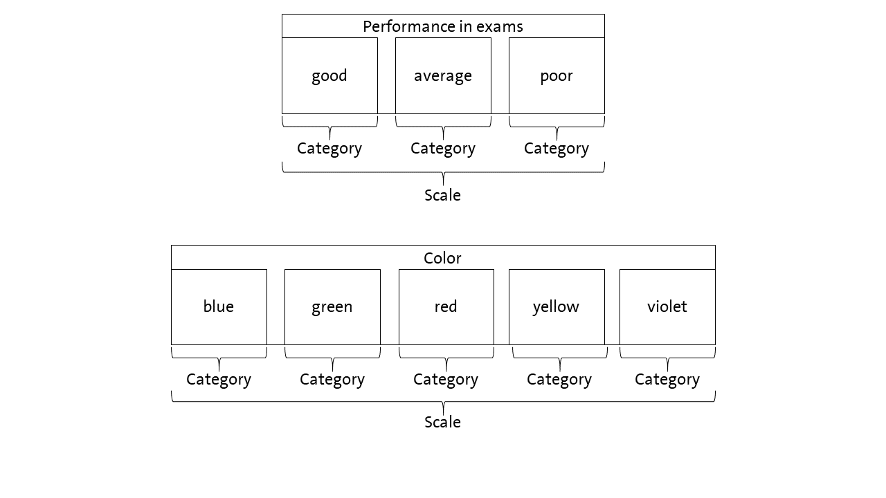
Regarding our example, the performance in the exams is the scale which is made up of three categories: “good”, “average” and “poor”. Since the categories can be sorted by degree or performance, they form an ordinal scale. An example for a nominal scale are colors. Here, the different colors are the categories. They make up the scale “color”.
It is very important to note that the Iota Concept differentiates between two layers of data, which are shown in Figure 2.
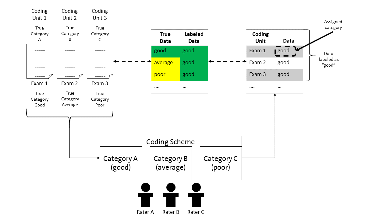
The coding units are the units to which a coding scheme is applied. In our example, these are the exams. Each exam has a true category. That is, an exam is good, average or poor. These categories make up the true data. However, the true categories are not inherently known. Thus, raters use a coding scheme to decide about the category of a coding unit. In the example, the raters have to judge if an exam is good, average or poor and assign the corresponding category to that coding unit/exam. All assignments make up the labeled data.
However, it is not ensured that the assigned category is the same as the true category. For example, in Figure 2, exam 1 is assigned to the category “good”, which is also the true category. Exam 2 is also assigned to the category “good”, although in truth, the exam represents an average exam. Alike applies to exam 3. The assigned category and true category should match, but this is not certain.
Since the assigned category and the true category may differ, the labeled data can vary in the degree of how well it reflects the true data. That is, the degree of overlapping between the true data and labeled data can vary. In Figure 2, three exams are assigned to be good exams. Thus, the data set contains three cases which are labeled as good exams. Although the cases are labeled as good, only one case really is a good exam. Thus, the true data and the labeled data for the category “good” overlap by 33%. For the category “average”, true data and labeled data overlap by 0% since there is one exam that in truth is an average exam. However, there is no labeled data representing this. Something similar applies for the category “poor”.
The aim of reliability is to ensure that the labeled data matches the true data as well as possible. To achieve this aim, the Iota Concept models the coding process and provides measures for quantifying the degree of reliability as shown in the following sections.
2 Example for using the Iota Concept of the second generation
2.1 Estimation
The calculation of all components of Iota2 can be requested by using
compute_iota2(). At this stage, it is crucial only to use
the part of the data set which contains the codings. In every case, the
coding units have to be in the rows and the raters in the columns. We
first save the codings in a new object, request the estimation of Iota2
and save the results.
codings<-iotarelr_written_exams[c("Coder A","Coder B","Coder C")]
res_iota2<-compute_iota2(data=codings,
                         random_starts = 10,
                         trace = FALSE)
The estimation of all components of Iota2 can take a moment. If you
would like to see the progression, you can set
trace = TRUE. After the estimation has finished, we can
request a summary with the function get_summary().
get_summary(res_iota2)
#> Summary
#>
#> Call: compute_iota2
#>
#> Number of Raters: 3
#> Number of Categories: 3
#> Categories: average,good,poor
#> Number of Coding Units: 318
#>
#> Random Start: 10
#> Log-Likelihood: 1020.63294056475
#> The best log-likelihood has been replicated.
#>
#> Primary Parameters
#> Assignment Error Matrix
#>         average  good  poor
#> average   0.917 0.083 0.000
#> good      0.326 0.493 0.181
#> poor      0.328 0.204 0.468
#>
#> Categorical Sizes
#> average    good    poor
#>   0.119   0.396   0.485
#>
#> Categorical Level
#>           dimensions average   good   poor
#> 1              Alpha  0.9171 0.4931 0.4684
#> 2               Beta  0.3718 0.5941 0.6595
#> 3               Iota  0.2685  0.387 0.4081
#> 4  Iota Error Type I  0.0243 0.3977 0.4631
#> 5 Iota Error Type II  0.7073 0.2153 0.1288
#>
#> Scale Level
#> Iota Index: 0.298
#> Static Iota Index: 0.074
#> Dynamic Iota Index: 0.267
The summary first shows basic information such as the number of raters, the number of categories, the concrete categories and the number of coding units. Next, the summary presents the log-likelihood which to some extent describes the quality of the model. Lower values imply a better fitting model than higher values. Additionally, the summary prints whether or not the the best log-likelihood could be replicated. If this is not the case, we recommend to increase the number of random starts and/or to investigate the solutions to ensure that the subsequent analyses are based on the best model possible .
2.2 Analysing the reliability on the categorical level
2.2.1 Interpretation of the central components
Next, the summary shows the results for the primary parameters. These are the Assignment Error Matrix and the categorical sizes, which are the basis for all other measures of the Iota Concept.
The Assignment Error Matrix describes the rating process. The true category is always in the rows and the assigned categories are always in the columns. In the current example, the first row describes how exams representing an average performance are assigned to the three different categories. An exam representing an average performance is assigned to be such an exam in about 91.7% of cases. In about 8.3% of cases, an average exam is assigned to be a good exam. Finally, an average exam is never assigned to be a poor exam. Here, the corresponding probability is about 0%.
When concentrating on the exams which reflect a good performance, the second row of the Assignment Error Matrix is important. In about 49.3% of cases, a good exam is assigned as a good exam. In other words: The probability to recognize a good exam as a good exam equals flipping a coin. In about 32.6% of cases, a good exam is assigned to the category “average”. That is, this exam is judged as showing an average performance, although it is truly a good exam. Finally, a good exam is rated as a “poor” exam in about 18.1% of cases. Thus, the raters make more mistakes in evaluating a good exam than an average exam (49.3% for good exams compared to 91.7% for average exams).
The categorical sizes represent an estimate for the distribution of the true categories in the population. In this example, we expect about 11.9% of all exams to be average, 39.6% to be good and 48.5% to be poor.
Based on the Assignment Error Matrix and the categorical sizes, additional measures of reliability can be derived. These are shown in the next lines of the summary. The first is the Alpha Reliability, which corresponds to the diagonal of the Assignment Error Matrix. This determines the probability that a coding unit of a specific category is correctly assigned to that category. In this example, a coding unit truly belonging to the category “average” is assigned to the category “average” in about 91.71% of cases. In other words: An exam truly representing an average performance is rated as an average exam in about 91.71% of cases. This value is quite high. In contrast, the Alpha Reliability of the category “good” is only .4933. This means that a coding unit truly belonging to the category “good” is assigned “good” only in about 50% of cases. This is quite a bad result. Alike applies for the category “poor”.
The next row presents the Beta Reliability, representing the probability that errors on other categories do not influence the category under investigation. In this example, the Beta Reliability of the category “average” is about .3718. This means that if a rater makes a mistake on the categories “good” or “poor”, the mistake is not assigned to the category “average” with a probability of 37.18%. In other words: If a rater has to judge an exam which truly represents a good or poor performance and if the rater does not recognize the good or poor performance, they do not assign the exam to the category “average” with a probability of 37.18% . Focusing on the category “poor”, the Beta Reliability is about .6596. This means: If a rater has to judge an exam which truly reflects an average or a good performance and if the rater does not recognize the good or average performance, they do not assign that exam as poor in about 65.96 % of the cases. Thus, the Beta Reliability can be used to show how errors on the other categories influence the data generated for a specific category. The higher the values, the less influenced the data for that category. In this example, the category “average” is more influenced by errors on both of the other categories than the categories “good” and “poor”.
Finally, Iota Reliability combines the Alpha and the Beta Reliability by taking the sizes of the categories into account. Iota Reliability is the core of the Iota Concept. Iota Reliability is a measure that describes how well the data labeled as a specific category really reflects that category. It considers three cases:
- all cases which are assigned to the correct category (Iota)
- all cases of that category which are not recovered (Iota Error I)
- all cases that are assigned to that category although they truly belong to another category (Iota Error II).
Before we start to interpret these values for the case of the example, some additional explanations are necessary. Figure 3 illustrates all three cases.
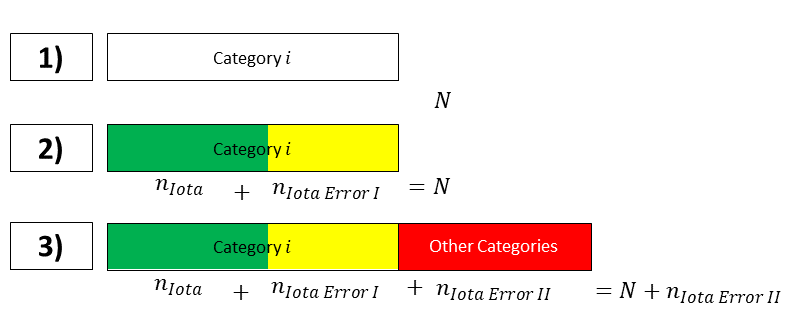
Referring to the first row in Figure 3, the box represents all coding units that truly belong to category i. In case of perfect reliability, the labeled data corresponds to these coding units.
Row two in Figure 3 splits the coding units of that category. The green part of the box represents the coding units which in truth belong to category i and which are part of the labeled data. The yellow part of the box represents the number of coding units which in truth belong to category i, but which are not assigned to category i. These coding units are missing in the labeled data. In the situation presented in row two, the total number of coding units representing category i is underestimated in the labeled data.
Let us now turn to the third row to provide a complete view. The labeled data of category i can also include coding units that truly belong to other categories. These coding units are represented by the red box. They are results from coding errors made in other categories and increase the number of units labeled as category i, although in truth, they do not belong to category i. Thus, these units contribute to an overestimation of the number of coding units truly belonging to category i.
Iota refers to the green box of row 3, Iota Error I refers to the yellow box and Iota Error II refers to the red box. All three measures are expressed as a ratio on .
With this in mind, we can now interpret the Iota
Reliability. The easiest way is by visualizing the values. This can
be done with the function plot_iota().
plot_iota(res_iota2)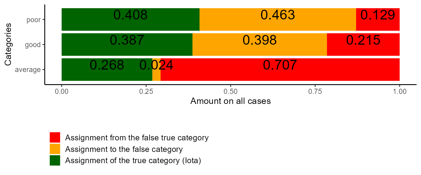
Figure 4: Example Plot of Iota
Category average: Let us start with the category “average”. For this category, Iota is about .268. This means that about 26.8% of the relevant labeled data really are average exams. The remaining 73.2% represent average exams that are missing in the results (Iota Error I) or represent exams that truly belong to other categories (Iota Error II). With the help of the plot, both of these cases can be characterized in more detail. The yellow rectangle represents the average exams which are not part of the labeled data. The number .024 indicates that only a few exams are “forgotten”. The red rectangle describes the amount of exams that are part of the labeled data for the average exams, but which are in truth good or poor exams. They make up about 70% of the labeled data. To sum up, the data representing the average exams
- recovers most of the exams that really are average exams (Iota).
- ignores only a small amount of exams which really are average exams (Iota Error I).
- is extremely biased by exams which in truth are good or poor (Iota Error II). Their amount is greater than Iota and Iota Error I combined, indicating that the number of coding units for average exams is extremely overestimated by the labeled data compared to the true data.
Thus, although the category “average” is quite reliable, the low reliability of both of the other categories destroys the high quality of the part of the data that should represent the average exams.
Category good: Turning to the category “good”, Iota is about .387, implying that about 38.7% of the data labeled as “good exams” really are good exams. However, nearly the same number of good exams are not represented in the data, as the yellow rectangle in the plot shows. Thus, half of the good exams are missing in the labeled data. . With a value of .215, only about 21.5% of the data is made up by exams that truly represent an average or a poor performance. Thus, the data labeled as “good exams”
- only consists of exams which are in truth good exams to about 39% (Iota).
- ignores about 50 % of the exams which are in truth good exams (Iota Error I).
- is weakly biased by exams that are in truth average or poor exams (Iota Error II).
In contrast to the data representing the average exams, the data representing the good exams is not extremely biased by those from other categories, but ignores a high number of relevant ones. Thus, the labeled data underestimates the number of truly good exams compared to the true data.
Category poor: Finally, let’s have a look at the category “poor”. Here, Iota is about .408, implying that the relevant data consist to 40.8% of the correct coding units/exams. However, Iota Error I is about .463, implying that a high number of truly poor exams is not represented within the labeled data for that category. Iota Error II is about .129 which is quite low, implying that about 12.9% of the relevant data is made up of coding units truly representing good or average exams. Thus, the data representing the poor exams
- consists only to about 40.8% of exams which are in truth poor exams (Iota).
- ignores about 53.2% of the exams which are in truth poor exams (Iota Error I).
- is weakly biased by exams that are in truth good or average exams (Iota Error II).
The number of poor exams is underestimated by the labeled data compared to the true data.
Summary: To sum up, the sample coding scheme guiding the ratings of the exams requires a revision. The data generated by the coding scheme is heavily biased in favor of average exams. The number of average exams is overestimated since a lot of good and poor exams are treated as average exams. As a consequence, the number of good and poor exams is underestimated. Since the Alpha Reliability of the category “average” is quite high, a revision should focus on the categories “good” and “poor”. This revision should aim to provide more precise definitions and clearer or more suitable examples that support raters in perceiving the true categories of the exams.
2.2.2 Coding Stream Analysis
Since version 0.1.3, ioatrelr provides an additional
analysis possibility via the function
plot_iota2_alluvial(). This function takes an an estimated
object of Iota2 and returns a plot representing the coding process
guided by a coding scheme. For the current example, the plot is shown in
Figure 5.
plot_alluvial<-plot_iota2_alluvial(res_iota2)
plot(plot_alluvial)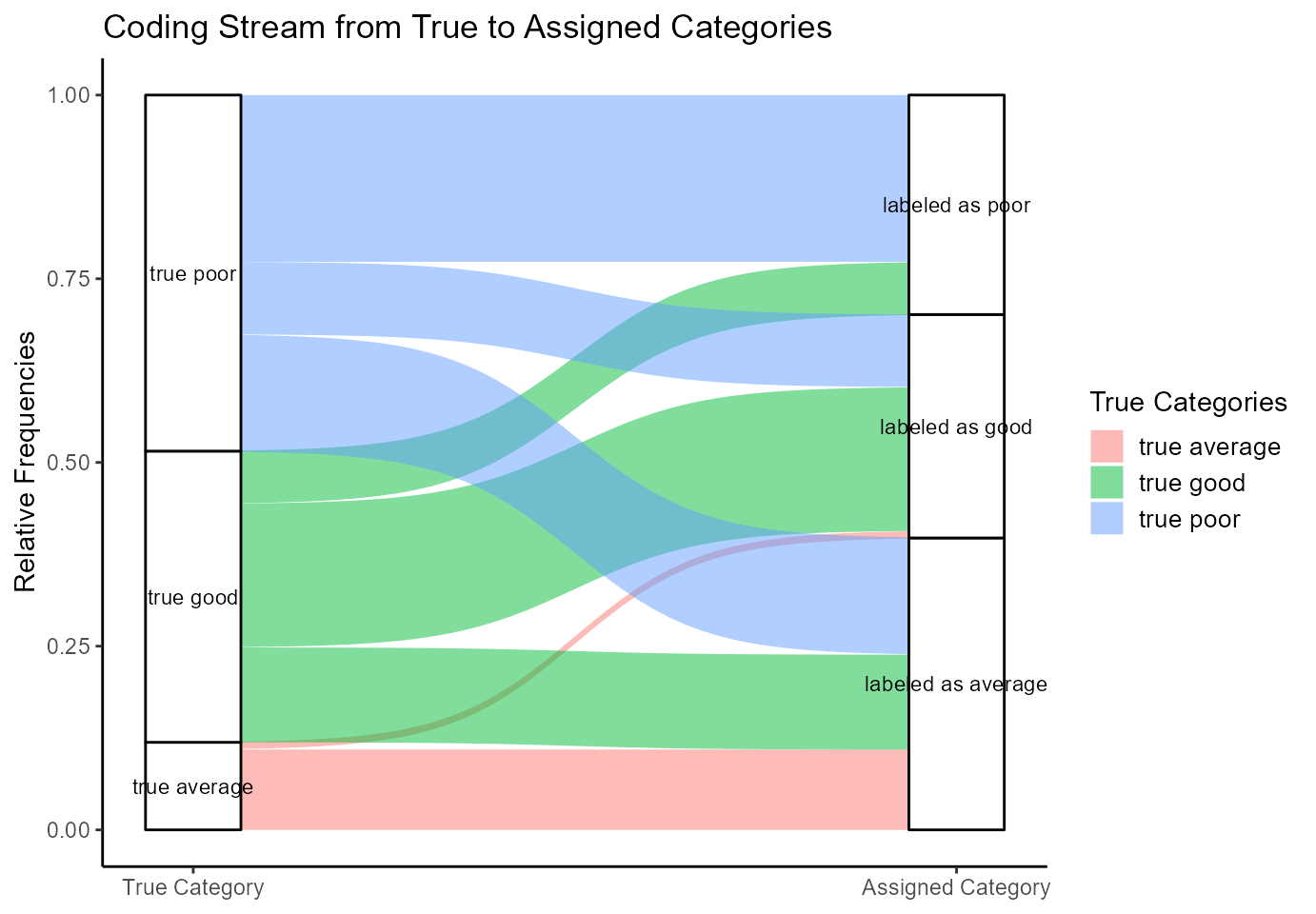
Figure 5: Alluvial Plot of Iota2
The boxes on the left side represent how the true categories are distributed in the population. Their height directly reflects the estimated true categorical sizes. The boxes on the right side show the amounts in the labeled data. The curves between the two pairs of boxes illustrate the coding process.
Average exams: Concentrating on the true average exams, the plot illustrates that most of the true average exams are part of the labeled data. This can be seen by the big red curve ranging from the true average exams to the labeled average exams. Only a very small number of true average exams is assigned as good exams. This can be seen on the very small red curve ranging from the true average exams to the good exams. Thus, most of the true average exams are correctly assigned.
However, the box for the labeled average exams is several times larger than the box for the true average exams. This indicates that the coding scheme tends to overestimate the number of average exams. Figure 5 illustrates that the source for this overestimation is in the truly good and the truly poor exams. This can be seen by the big green curve ranging from the truly good exams to the labeled average exams and by the big blue curve ranging from the truly poor exams to the labeled average exams.
Good exams: A similar analysis is possible for the good exams. The three green curves ranging from the truly good exams to the other categories illustrate how the truly good exams are assigned to the different possible categories. The two big curves show that most of the truly good exams are assigned to the categories “good” and “average”. The smaller green curve indicates that a smaller number of truly good exams are assigned to the category of poor exams. The box for the truly good exams is smaller than the box for the labeled good exams indicating that the labeled data underestimates the number of good exams. The coding units behind the labeled data for the good exams is made up mostly by truly good exams (big green curve) followed by a high number of truly poor exams (big blue curve) and only a very small number of truly average exams (red curve).
Poor exams: Finally, the box for the labeled poor exams is about 0.5 times smaller than the box for the truly poor exams, indicating that the total number of poor exams is underestimated by the coding scheme. The three blue curves illustrate that most of the truly poor exams are assigned to the category “poor” in the labeled data. A similar number of truly poor exams is assigned to the category “average” and only a smaller number is assigned to the category “good”.
Summing up, the alluvial plot for Iota2 provides additional insights into how a coding scheme works by illustrating the coding stream and splitting up Iota, Iota Error I and Iota Error II into more detail.This can be very helpful for judging the quality of data and for reviewing a coding scheme.
2.3 Analysing the reliability on the scale level
In many cases, not only the reliability of singles categories is important but also the reliability of the complete scale. The Iota Concept provides several measures for characterizing this kind of reliability. Currently, we recommend to use the Dynamic Iota Index. This measure ranges from 0 to 1, 0 indicating the absence of reliability, 1 indicating a perfect reliability. Referring to the summary above, the Dynamic Iota Index is about .267. This is a low value which replicates the analysis on the categorical level.
According to the the rules of thumb developed by Berding and Pargmann (2022), this value is not sufficient to generate reliable data. The value should be at least .829 to allow subsequent statistical analysis such as correlation analysis or significance testing. This is due to the fact that this degree of reliability leads to high deviations from the true sample correlation and suffers from a high risk of drawing wrong conclusions from statistical analyses.
3 Further readings
In this vignette, we presented the very basic usage of the Iota Concept. If you would like to lean more about the consequences of reliability on the scale level, we would like to recommend the vignette Estimating Consequences for Subsequent Analysis. If you are interested in how the Iota Concept can be used to analyze if a coding scheme performs similarly for different group of materials, we recommend the vignette Different Guidance Functioning.
As we are permanently working on improving Iota Concept, please check the package’s website for news.
For more details, we would like to refer to the following literature:
Florian Berding and Julia Pargmann (2022). Iota Reliability Concept of the Second Generation. Measures for Content Analysis Done by Humans or Artificial Intelligence. Berlin: Logos. https://doi.org/10.30819/5581
Florian Berding, Elisabeth Riebenbauer, Simone Stuetz, Heike Jahncke, Andreas Slopinski, and Karin Rebmann (2022). Performance and Configuration of Artificial Intelligence in Educational Settings. Introducing a New Reliability Concept Based on Content Analysis. Frontiers in Education. https://doi.org/10.3389/feduc.2022.818365